How to design an academic conference poster that stands out (without overwhelming your audience)
Academic conference posters have a reputation.
You walk into a room full of coffee, tote bags, and enormous boards covered in dense text. People squint. They hover awkwardly. They pretend to read paragraphs that look suspiciously like a thesis chapter pasted onto cardboard.
It does not have to be this way.
A well-designed conference poster can spark real conversations, attract collaborators, and help you refine how you talk about your research. Especially for PhD researchers, posters are often the first low-stakes way to share your work publicly.
The key is understanding one thing:
A poster is not a paper on a wall. It is a visual conversation starter.
Let’s look at how to design one properly.
What is the purpose of a conference poster?
Your poster is your research at a glance.
It should:
Communicate the core of your study quickly
Make your contribution clear
Invite conversation
Leave people wanting to know more
It is closer to a research trailer than a research article.
During a poster session, attendees move around the room. They decide in seconds whether to stop. Your design determines whether they approach. Your explanation determines whether they stay.
Start with layout, not text
Most weak posters begin with writing. Strong posters begin with structure.
Before you draft paragraphs, decide:
What are the 4–6 key elements I want visible?
What is the visual hierarchy?
What should someone understand within 10 seconds?
Most academic posters work well with:
A concise, informative title
A clear research question or aim
A brief methods overview
2-4 key findings or themes
A short implications section
Resist the temptation to include everything. If it requires close reading, it probably belongs in a paper, not on a poster.
Use design tools that support clarity
This is where Canva is genuinely helpful.
Create a custom canvas in the correct size (A0 or A1, depending on the conference guidelines). Use grids to create alignment. Keep spacing generous.
White space is not wasted space. It improves readability.
Avoid trying to force Word or PowerPoint into doing something they are not designed to do. Clean layout reduces cognitive load for your audience.
Cut the words more than feels comfortable
This is where most PhD researchers struggle.
You are trained to justify, explain, nuance, and defend.
A poster is different.
If your body text is smaller than 24pt, it is too small. Headings should usually be 48pt or larger.
Ask yourself: If someone is standing a metre away, can they read this comfortably?
Replace paragraphs with short, precise statements.
Instead of:
"This study explores the lived experiences of early-career nurses navigating emotionally demanding clinical environments.”
Try:
“Exploring how early-career nurses experience emotional labour in acute settings.”
You are not dumbing down your research. You are increasing accessibility.
Use visuals strategically
Visuals should clarify, not decorate.

Good uses of visuals include:
A simple conceptual framework diagram
A thematic map (particularly useful for qualitative research)
A clearly labelled graph
A short, bold participant quote
If your research does not naturally lend itself to charts, consider a visual model of your findings, a timeline, a process diagram, a refined thematic map.
Avoid random stock images that add nothing conceptually. Every element on the poster should earn its place.
Common poster mistakes to avoid
Overcrowding - If everything is important, nothing is. Leave space.
Low contrast - Light grey text on white background is inaccessible. Ensure strong contrast.
Overdesign - Two fonts are enough. A restrained colour palette works best. This is an academic space, not a festival flyer.
Copy-pasting thesis text - Your literature review does not belong here.
How to present your poster confidently
Design is only half the job.
When someone approaches, offer a concise overview. Around 30–60 seconds is ideal. Structure it simply:
What the study is about
Why it matters
What you found
Why that finding is significant
You are not reciting your methods chapter. You are initiating dialogue.
Bring a QR code linking to:
Your website if you have one (or your university staff / doctoral student profile page)
A PDF version of the poster
Your LinkedIn
A preprint or related paper
This allows the conversation to continue after the conference.
Are poster presentations “less than” papers?
No.
Poster sessions are often where the most honest conversations happen. They allow early feedback. They create space for dialogue rather than performance.
For qualitative researchers especially, posters are powerful because you can visualise your thematic structure, foreground participant voice, and show conceptual nuance visually.
They are not inferior. They are different.
And when done well, they are memorable.
Clear and confident
A strong academic poster is clear, restrained, and intentional.
It does not overwhelm.
It does not replicate your thesis.
It makes people curious.
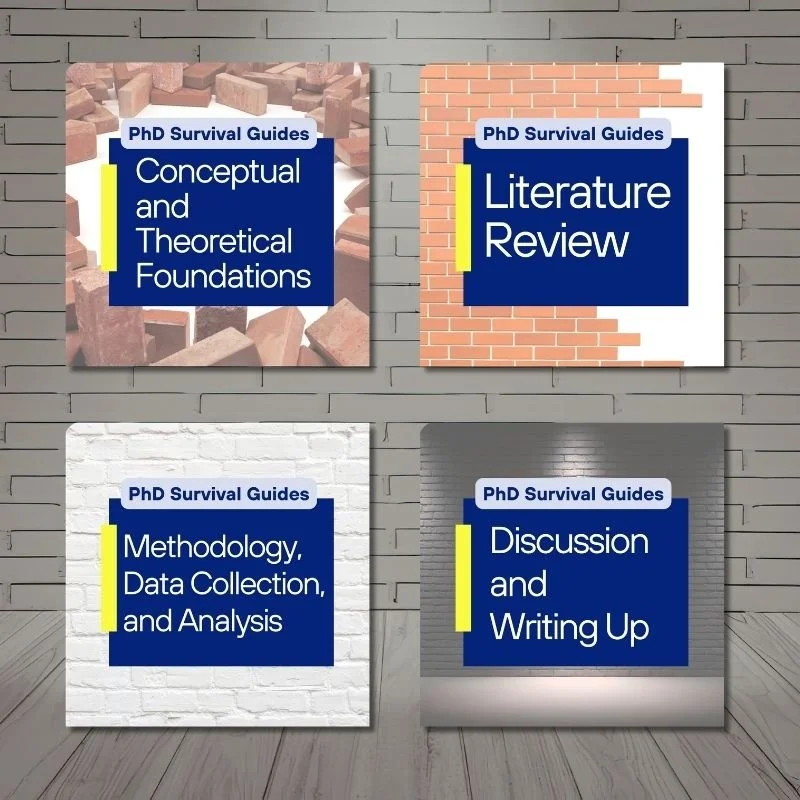
If you are a qualitative researcher preparing for your first conference and want structured guidance on presenting your research clearly and confidently - not just visually, but intellectually - my PhD Survival Guides walk you through how to articulate your contribution, structure your arguments, and communicate your work effectively in academic spaces.
If you are serious about doing this well, that support exists.
And if you would like thoughtful guidance on navigating academic life with more clarity and less noise, you are welcome inside my email community.
Conferences are not about perfection.
They are about connection.